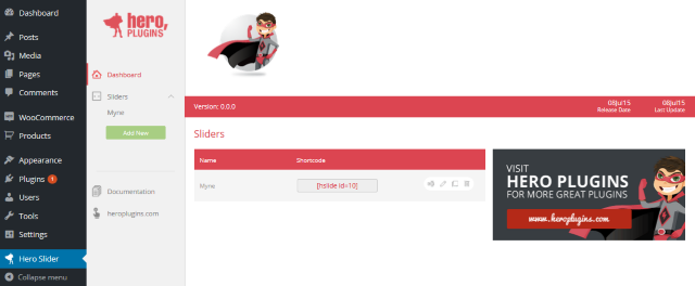
Once HeroSlider has been activated, browse to HeroSlider from your WordPress admin dashboard. This will take you to the HeroSlider dashboard. The dashboard will provide you with an easy view of all sliders currently on your website, along with their short-codes, and you can use the controls to rename, edit, duplicate or delete a slider.
To create a new slider, click on the ‘Add New’ button – then enter the name for your slider in the text box that opens below and click ‘Add’.
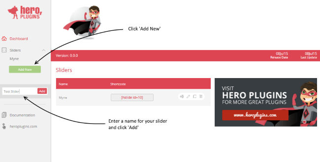
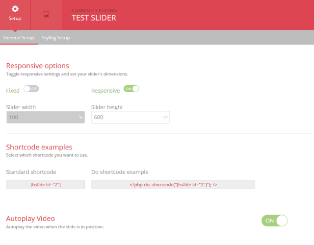
Once you click on ‘Add’, your new slider is created, and you will automatically be redirected to the General Setup tab for your slider
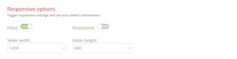
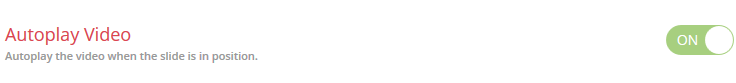
The options on this tab will allow you to specify whether you would like your slider to be responsive or fixed-width, and to set the dimensions for your slider (in px). The Autoplay Video option, which can be switched on or off, controls whether any videos included on your slides automatically start playing once the slide has finished loading. Please note that this setting is universal to this particular slider, and will affect any videos added to your slides.
Please take note of the following:
Make sure to select your responsiveness settings before proceeding. Changing the setting after creating slides may result in errors.
Finaly, you will find your short-code snippets for your slider, which you can copy and paste to your page, or implement directly to your template files.
The next available tab is the Styling Setup tab, which adjusts the overall appearance of your slider as well as its navigational elements. For the purposes of the Quick Start however, we will proceed with the default settings – we will cover this section in more detail in the full documentation.
In this Quick Start, we will be creating an example slide with a background image and a single text element.
When you navigate to your Slide Setup tab for the first time, a blank slide will automatically be created for you, and you will see the following:
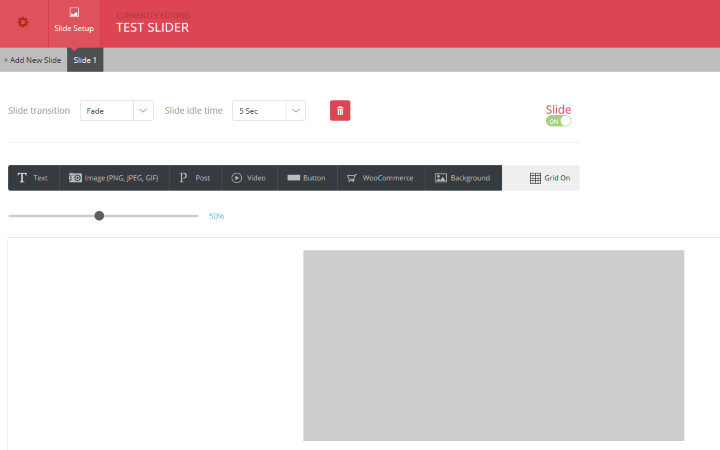
Add new slides by clicking on the Add New Slide button – new slides will be listed as seperate tabs on the slide bar. Slides can be reordered by means of drag-and-drop – simply hover your cursor over the slide you want to move until the handle appears and then drag the slide to its new position.
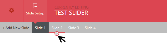
The top controls allow you to change your slide’s transition effect and idle time, delete the slide, or to enable/disable that particular slide, preventing it from appearing in on your live slider.

The second toolbar contains the various elements which can be added to your slide. Clicking on any of these will open a dialogue box which you can use to add your element to your slide, and it contains all the settings and options needed to adjust the appearance of your element as it appears on your slide.
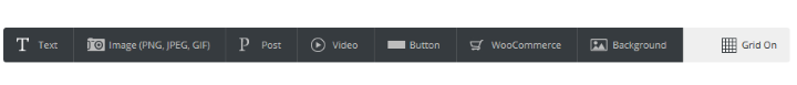
Clicking on the Background button will take you directly to the Media Library, while the Grid On will overlay a grid on the canvas which you can use to position your elements. This grid is not visible on live slides.
HeroSlide supports both video and static backgrounds. To add a static image to the background of your canvas, you can click on the Background button in the Elements toolbar, and it will open the WordPress Media Library, from which you can either choose an image you have already uploaded, or upload an image. In order to make use of the Video Background Functionality, you will need to scroll down to the Slide Background section on this tab, and click on the Video button.
We will cover the Video Background functionality in more detail in the general documentation.
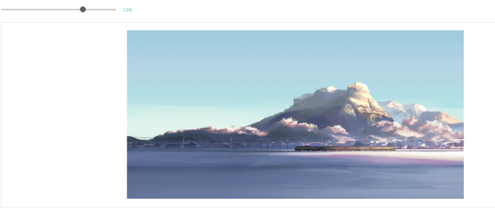
Once you have selected your background, the Preview Canvas will update. You can use the Zoom tool to zoom in and out of your canvas.
To add text to your slide, click on the Text button – this will open the Text Element dialogue box.
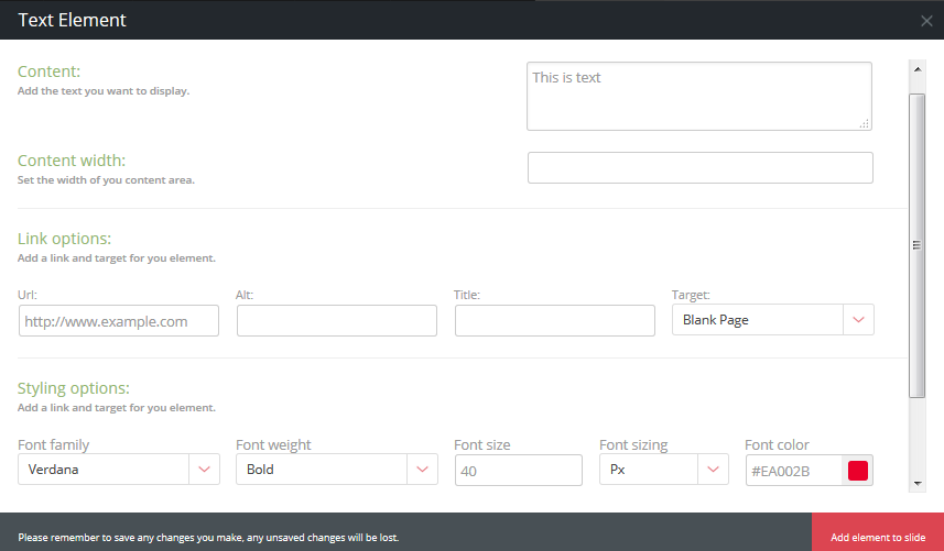
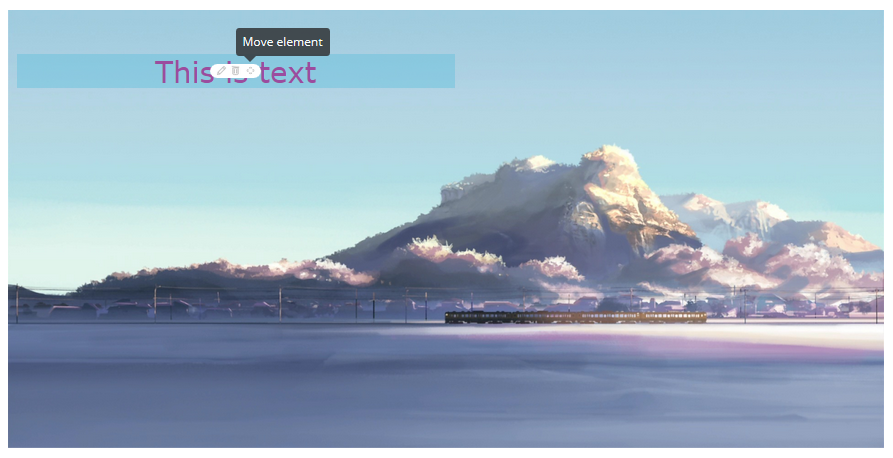
Here you will find all the formatting and appearance settings for your text element. Once you have completed all the fields as needed (the URL field can be left blank if you do not want it to be a link), click on the Add Element to Slide button in the lower-right corner of the dialogue box. The text element will appear on the Preview canvas, and will also be listed in the Element Animation Control section, which you can use to change the animation of the element.
You can edit this element (and any other elements you add) by hovering over it and making the Edit, Delete and Move controls appear. Moving the element is a simple case of clicking on the Move icon and dragging the element to your desired location. Clicking on the Edit icon will re-open the Text Element Dialogue box.
Any additional elements on the elements toolbar below will follow a similar procedure – although the various settings may vary slightly.
You can integrate your slider in one of two ways:
You can add the short-code directly to the page by copying it from your General Setup tab and pasting it into your content area.
You can implement the slider directly to your template by adding the ‘do_shortcode’ to your template files where you want it to appear.
When you first create your slider you will automatically be redirected to the Setup tab for your slider. The settings contained within this tab control the overall appearance of your slider, and should be considered universal settings.
It is advisable to finalize settings in the Setup tab before moving on to create individual slides, since changing settings afterwards may result in display errors. This is especially important when considering responsiveness.
The General Settings tab contains settings controlling the slider’s responsiveness and dimensions, and the Video Autoplay toggle.
Responsive Options – Toggle between a Responsive or a Fixed-width setting for your slider. When Responsive is switched on, the slider width textbox will be inactive and will default to 100%, but the height can be adjusted.
Video Autoplay – Switch Video Autoplay on or off. This setting is universal and will affect all videos embedded on individual slides.
This tab also contains the shortcode examples you will need when adding the slider to a page or template file.
The Styling tab contains the settings that control the visual appearance of your slider and its navigational elements. Please keep in mind that these settings are global and applies to the entire slider.
This section toggles and controls the appearance of a slider’s navigation arrows. When switched off, no navigation arrows will appear on your slides.
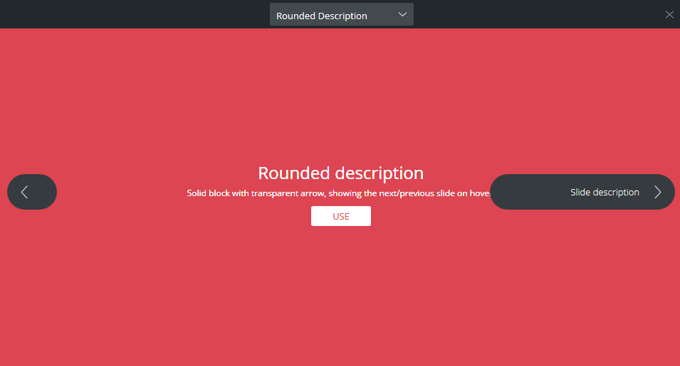
You can choose between 7 arrow styles, and adjust their primary and secondary colors. The two images below the dropdowns and color pickers provide you with a static preview of the arrows as they will appear on your slider, but will not take your color choices into account.
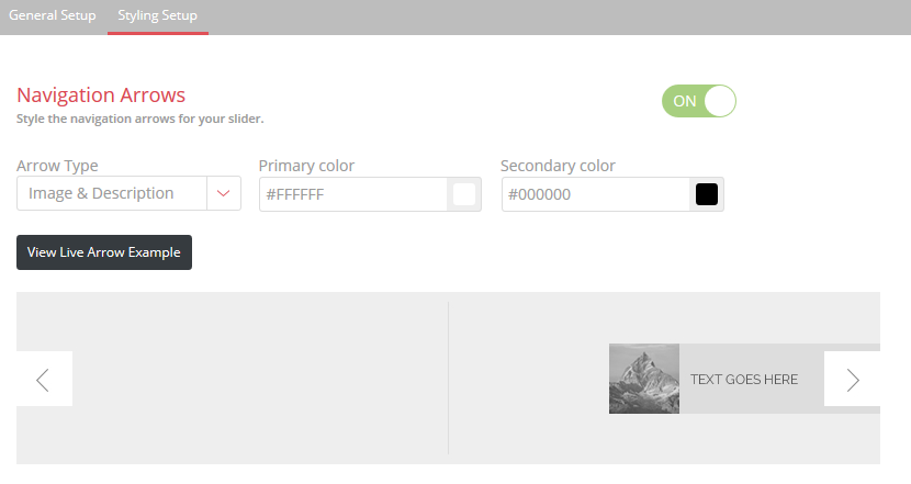
Clicking on the View Live Arrow Example button will open a pop-up, which will provide you with an easy way of previewing the different arrow styles – clicking on the Use button will update the setting and close the pop-up. Please note, however, that neither the static or live previews will take your color choices into account.
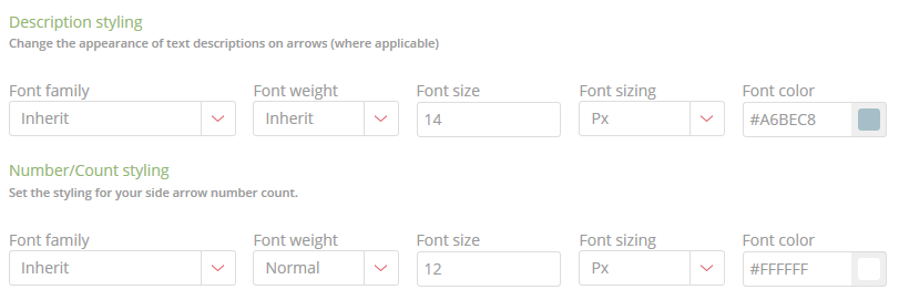
You may notice, while going through the various styles, that some of the navigation arrows have descriptions and numbering text elements. The format and appearance of these can be changed in the Description Styling and the Number/Count Styling sections pictured below:
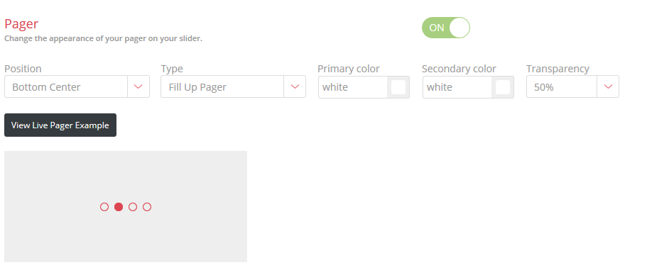
This section toggles and controls the appearance of a slider’s pager. When switched off, no pager will appear on your slides.
The plugin includes three different pager styles, and you can adjust their primary and secondary colors, while also specifying the placement of the pager on your slide. As with the navigation arrow controls, you can see a static preview of the styles, but also see a live example by clicking on the View Live Pager Example button.
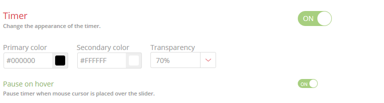
HeroSlider allows you to have a timing progress bar underneath your slides, which can be toggled on or off in this section
Other settings will allow you to adjust the color and transparency of the timer, and you also have the option of pausing the timer when a user hovers their cursor over the slider.
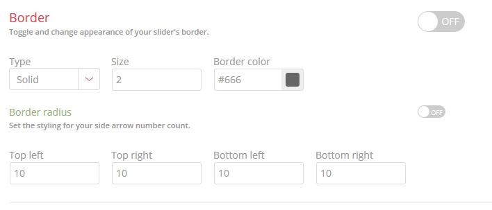
Enable or disable and style your slider’s border. This option is off by default – switching it on will enable a border on your slider and allow you to choose one of three different border styles, along with the border width and color. The border controls also support rounded corners for your border, and you can individually adjust the settings for each corner.
When visiting the Slide Setup tab for the first time, a blank slide will already have been created for you. This will also happen whenever you delete all the slides you already have
To add new slides to your slider, simply click the + Add New Slide button. This will create a new blank slide, which will be listed on the bar next to your first slide.
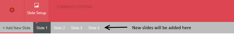
The slides will always be listed in numerical order – so if, for example, you rearrange your slides by moving Slide 2 into Slide 1’s position, Slide 2 will be renamed to Slide 1, while Slide 1 will renamed to Slide 2.
In the event that you want to rearrange your slides, hover your cursor over the slide you want to move – a handle will appear on the bottom border. Simply click and drag your slider to its new position.
In order to add a static background image to any of your slides click on the background button in the element toolbar.

Clicking on the background button in the element toolbar will open the WordPress media library, which you can use to either upload an image, or to select an image you have previously uploaded.
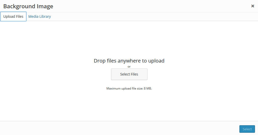
Click on the Select Files button to select the file, or simply drag the file you want to upload into the box. Once the file has been uploaded, click on the blue Select button – using the normal Media Library fields you can specify the alt text and description for the background image.
In order to adjust additional settings for your background image, you will need to scroll further down the page to the Slide Background section on the slide settings page.
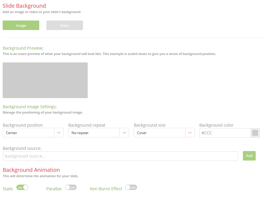
In this section you will see a scaled down version of your slider background (without any elements), and can adjust your background positioning, repeat and sizing, or specify a background color if you choose not to use an image.
The background image can be replaced by uploading a new background image source – simply click the Add button, which will open your media library.
Finally, you have the option of switching between a static background image or one of two animation effects – a parallax or the Ken Burns effect. Switching the Ken Burns effect on will enable additional settings that control the zoom and transition direction for the effect.
HeroSlider allows for the application of a video background to individual slides, and supports the following three file formats:
In order to apply a video background, when settings page for the slide you want to add the video background to, scroll down to the Slide Background section of the page. Clicking on the Video button will replace the background settings with upload fields for your videos.
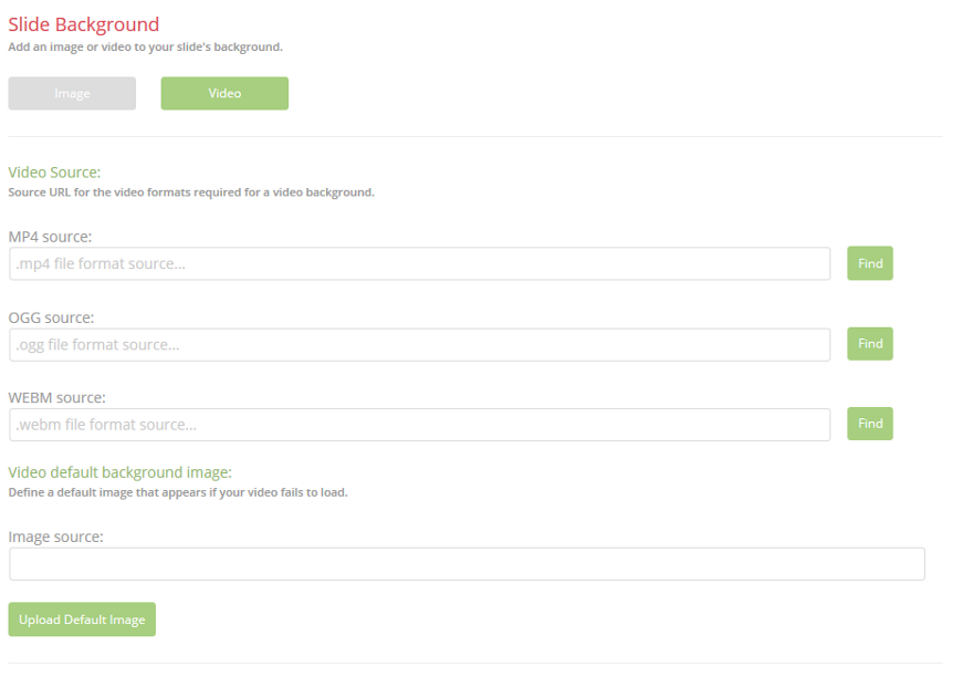
Since not all formats are supported by all browsers, you can upload a video for each format, and the plugin will select an appropriate version based on the browser your visitor is using. Clicking on the Find button will open the WordPress media library, where you can upload or select a video you have previously uploaded.
A fallback image can be defined for those cases where a video fails to load properly, by clicking on the Upload Default Image button – this follows a procedure similar to the above or adding a background image to your slide.
Each element that can be added to the slider has its own button – each of which will open a dialogue box containing the settings and fields for that particular element.
Each of the elements follows the same procedure for being added to a slide, and each element is contained on its own layer, giving you the ability to freely move elements about the canvas.
Clicking on the Text button will open the Text Element dialogue box (pictured below).
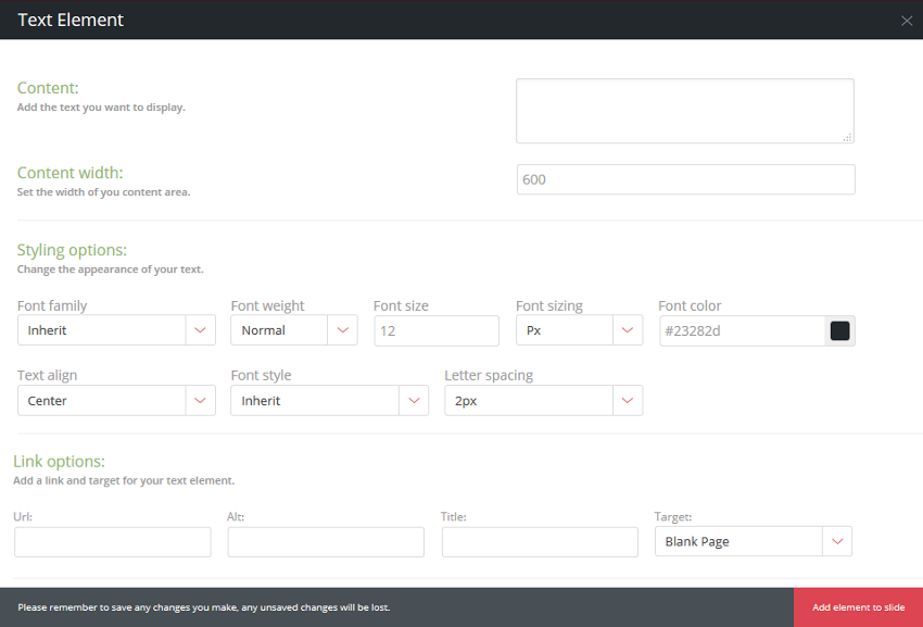
Add the text you want to display to the content box, and use the Content width field to specify the width of your content area. Should your text contend be wider than the content area you have defined, the text will wrap. The styling otions will allow you to adjust the appearance of your text. In order to turn the element into a link, add the link details (URL, Alt text and target) – if you leave these fields blank the element will not link and remain static text.
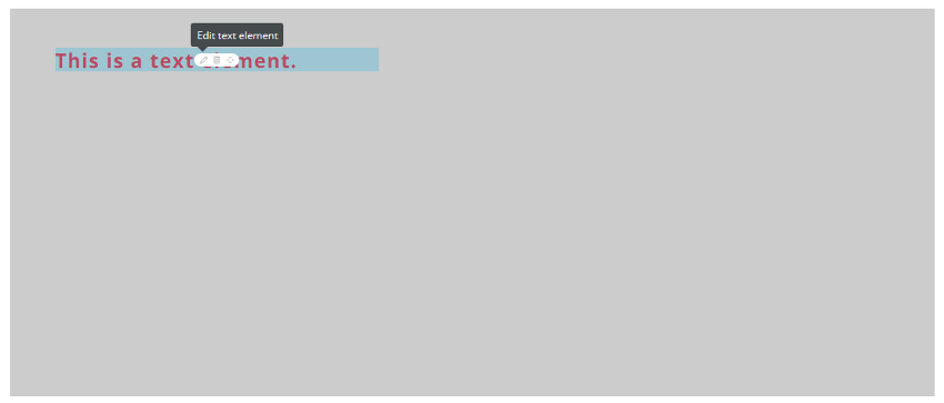
Once you have completed all the fields in the dialogue box to your satisfaction, click on the Add Element to Slide button, and the text will be added to your slide, as pictured in the example below. Should you wish to edit or reposition the element, hover your cursor over the text – this will highlight the element and make the edit, delete and move controls appear. Clicking on edit will reopen the dialogue box. You have the option of enabling a grid that will aid you in positioning your element where you want it.
Each element that can be added to the slider has its own button – each of which will open a dialogue box containing the settings and fields for that particular element.
Each of the elements follows the same procedure for being added to a slide, and each element is contained on its own layer, giving you the ability to freely move elements about the canvas.
While HeroSlider supports the use of Video Backgrounds on your slides, you also have the option of embedding a seperate video element on your slide.
Clicking on the Video button will open the Video Element dialogue box (pictured below).
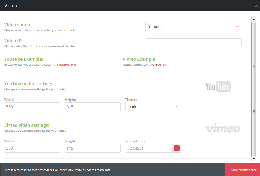
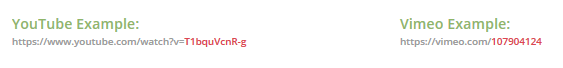
HeroSlider supports embeds from either YouTube or Vimeo. To add a video, first select the video source from the first dropdown (YouTube or Vimeo) and then enter the video ID in the field below.
Please take note to ONLY enter the ID as indicated in the image below – not the entire URL of the video.
Finally, you can change the dimensions of your video and make slight adjustments to the appearance of the controls.
Each element that can be added to the slider has its own button – each of which will open a dialogue box containing the settings and fields for that particular element. Apart from the background images, HeroSlider also allows the addition of separate image elements to the slide, each on their own separate layer, enabling the ability to apply separate effects and animations.
Clicking on the Image button will open a dialogue box with settings and fields needed to add images to your slider.
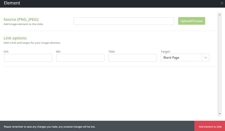
Clicking on the Choose/Upload button will open the WordPress media library, where you can either upload your image, or select it if you have previously uploaded it. All standard image formats are supported (JPEG, GIF, PNG etc), but please ensure that the image is sized correctly before adding it to your slide.
Images can be turned into links by simply adding the link details in the Link Options – if linking is not required, these fields can be left blank.
Each element that can be added to the slider has its own button – each of which will open a dialogue box containing the settings and fields for that particular element. HeroSlider supports the addition of Buttons which can be used as link elements if you prefer not using separate text or image links on your slide
Clicking on Button in the elements toolbar will open the dialogue box for the button element, as pictured below:
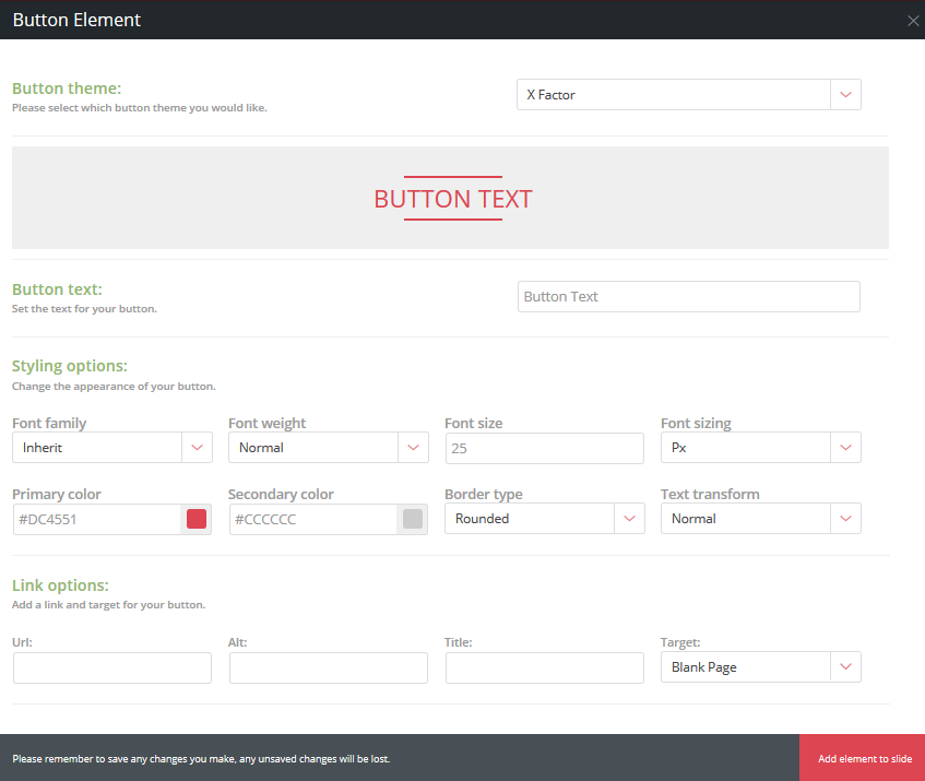
The Button Theme setting allows you to choose one of eight styles you want to use for your button. As you choose a style, the live preview will update to reflect your choice, and you can hover your cursor over the button to see the animation effects for that particular button style.
The Button Text field is used to define the text displayed on the button.
The Button Styling section contains all the settings required to adjust the look, feel and formatting of your button, such as the button and text colors, font size and font family.
Finally, you can use the fields in Link Options to add your link details and target.
With HeroSlider, it is possible to display items from your WooCommerce store on slides.
In order to add products from your WooCommerce store to any of your slides, you will need to ensure that the WooCommerce plugin is installed. HeroSlider will check for the presence of the plugin – in the event that it is not installed/activated, a notification in the sidebar will display that it’s not active. In addition, the WooCommerce button in your element toolbar will be inactive and will not react to clicks.
Clicking on the WooCommerce button will open the WooCommerce element dialogue box:
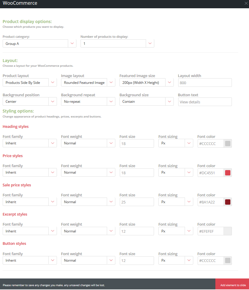
You will first need to specify the category of products you wish to display, along with the number of products. When deciding on the number of products you wish to display, please keep the dimensions of your slide, as well as the Layout Width of the element – if your products take up too much width, they will break into another row.
In the layout section, you get to specify the layout of your products on the slider. The images below offer examples of the three different layouts you can select – alternatively, see a live preview on our slider demo page From top to bottom are:

Additional settings in this dialogue box will control the appearance of your product images, as well the text elements such as your heading, prices, description and product page links.
Each element added to your slide canvas is contained on its own seperate layer, making it easy to move and manipulate specific elements on your canvas.
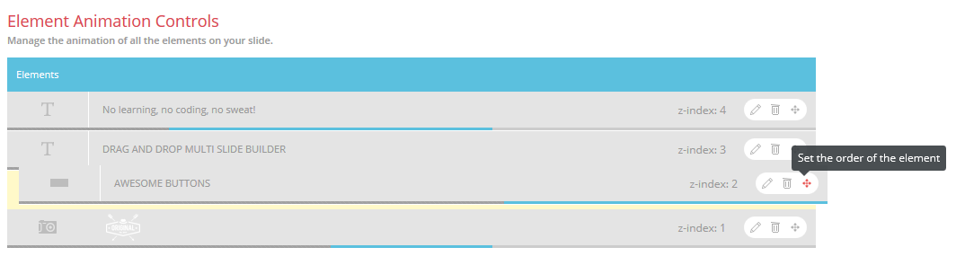
In the case where you would like to rearrange your layer order in order to have one layer over another (ie modifying the z-index), this can easily be accomplished in the Element Animation Controls section on your slide’s tab. This section will list all of the elements currently added to your slide.
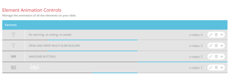
The elements are listed by their respective z-index in decending order – in other words, from the top down. The lowest z-index will always be 1, with items with a higher z-index overlaying any item with a lower index. The background of any particular slide will always occupy z-index of 0, but is not included in this list.
To reorder your layers, simply hover your cursor over the move control of the layer you want to move, and drag and drop the layer to it’s new position in the list.
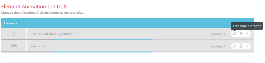
All elements added to your slides already have a default animation, and will slide into view from the left as your slide loads. It is, however, possible to change the animation directions and timing of your elements, and to do this you will need to scroll down to the Element Animation Control section of the slide’s settings page.
All of the elements currently added to your slide will be listed in that section by their z-index in descending order. To make changes to the animation settings of an element, simply click on the edit control, as pictured below:
The animation settings for that particular panel will then slide open, containing the various animation types and styles, as well as the settings for timing of the animation, and the animation timeline. It should be noted that the animation settings are the same regardless of the type of element you are making changes to:
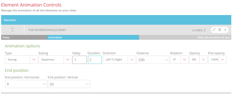
Immediately above the settings is your animation timeline, which consists of three sections –
Please note that the Slide Idle Duration showing in the example above is the entire idle duration for the slide before transitioning to the next slide in your series – this is adjusted by selecting your slide idle interval in the Slide Idle Time dropdown at the top of the settings for your slide. Below is an example of an animation timeline for a slide with a 10-second idle time (Animation and animation delay times are still 2 seconds and 1 second, respectively).

The final setting available on the panel is your End Position which is used to specify where the element rests when its animation completes. While this can be specified manually by changing the values in the text boxes, you can also adjust this by dragging the element to the desired location on your canvas.
NOTE: It's that festive time of year again and we will be taking a short break to recharge from the 16th of December 2020 until the 3rd of January 2021. During this time our support will be limited but we will try to respond to high priority tickets as best we can. Have a great holiday!
OUR HEROES WILL BE HANGING UP THEIR CAPES FOR A SHORT BREAK!
We'll be out of office from the 2nd of August until the 18th of August 2019. Please note that during this time we will not be available to assist with support queries but will be right back to assist from Monday the 19th of August 2019. We appreciate your patience and support!
While we will always do our best to get back to you within an hour or two, we ask that you please allow for a maximum of 24 hours for feedback.
Monday to Friday, 9am to 5pm in the UTC+2 Timezone.
Bug fixing
How to questions
Assistance with integration
Support for 3rd party plugins
Custom Coding
Theme customization
Stay informed about all new releases and product updates