To get started, please download HeroMenu from CodeCanyon
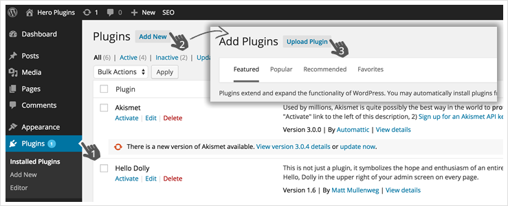
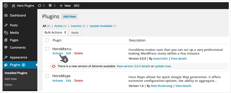
In your WordPress backend, navigate to Plugins » Add New » Upload Plugin. Browse to the zip file that you have just downloaded from CodeCanyon and follow the prompts to install & activate HeroMenu.
Take note
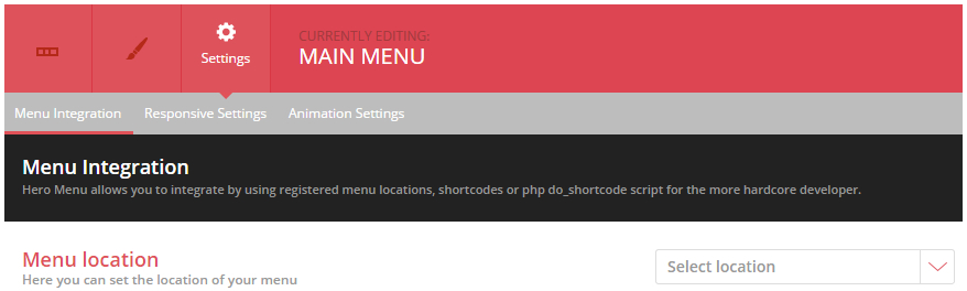
When HeroMenu is installed and activated, it will have no effect on your website frontend. You will only see a change on your website once you have finished setting up your navigation in HeroMenu. Activating your menu can be done here Settings » Menu Integration
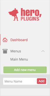
To create your first menu, navigate to Hero Menu » Menus » Add new menu.
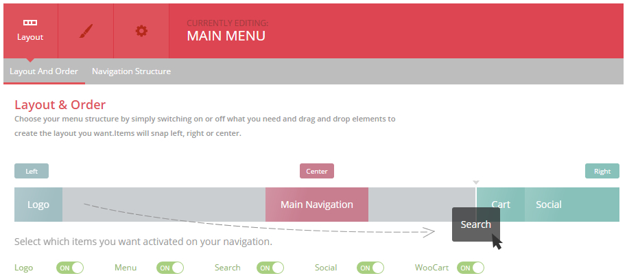
Layout » Layout and Order
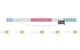
Choose your menu layout by simply switching on or off what you need and drag and drop the items in the order you want. Items will snap left, right or centre.
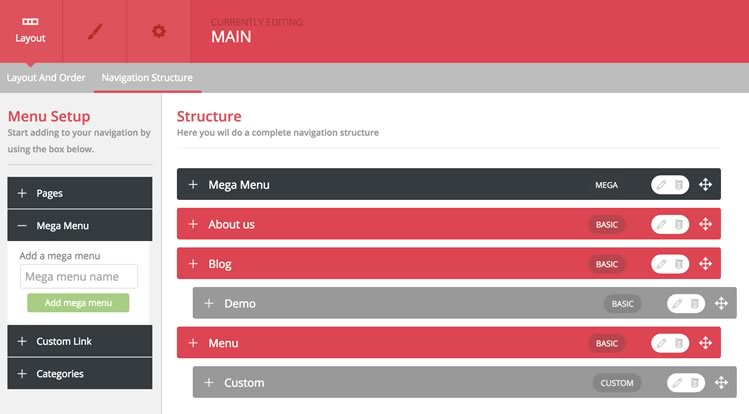
Layout » Navigation Structure
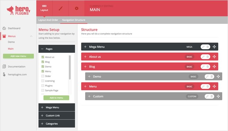
Select the pages that you want to add to your menu from the items on the left.
Click “Add to menu” once pages are selected.
This bit works very similar to the standard WordPress Menu builder, so you’ll feel very comfortable using this.
The following types of items can be added to your navigation.
Pages
Mega Menu’s
Custom Links
Categories
Quick tip
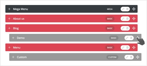
Drag items up and down to change order.Drag items slightly to the right and it will snap under another menu item to become a submenu of that item.
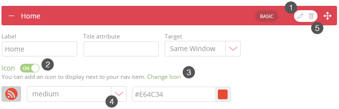
Click on the little pencil button of each menu item to start edit. Here you will see all the basic elements that you would want to change or edit.
Icons can be added to each menu item by clicking on the icon button.
Select the appropriate icon. We supply you with 360 free icons to use as you please.
The size and colour of the icon are also editable.
Deleting a nav item can be done by clicking on the “bin” button next to the “edit” button.

A very intuitive and visual way to style your navigation. This allows you to style every aspect of your navigation. This includes menu bar, drop downs, mega menus, fonts, colors, size, icons and many more. Our default settings are styled in a way that would look and function great with any website. So by leaving everything as is, should leave you with a great looking menu.
This is the exciting part of HeroMenu, seeing the live version on your website. You can integrate/activate your menu using one of the following steps:
8.1 Menu Location Selector
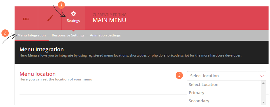
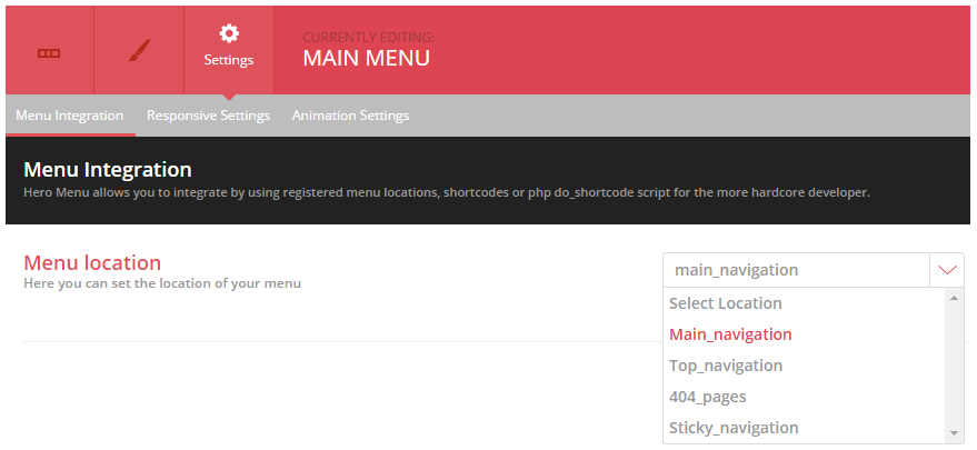
The recommended way of activating your menu, is by selecting the menu location. Navigate to Settings » Menu Integration » Select a Location. To replace the standard WP menu that comes with your theme, select “Primary” from the dropdown list. This should replace the main menu of your WP theme.
Theme locations
Theme location labels could change relative to current theme, most themes should have Primary, Main and Secondary.
8.2 Manual Integration: Plain Shortcode
Add the following shortcode to one of you pages/posts, remember to click update.
[hmenu id=1]
8.3 Manual Integration: do_shortcode For example, replace the following code in your header.php file:
<header id="masthead" class="site-header">
<div id="navbar" class="navbar"><nav id="site-navigation" class="navigation main-navigation"><button class="menu-toggle"><!--?php _e( 'Menu', 'twentythirteen' ); ?--></button>
<!--?php _e( 'Skip to content', 'twentythirteen' ); ?-->
<!--?php wp_nav_menu( array( 'theme_location' => 'primary', 'menu_class' => 'nav-menu' ) ); ?-->
<!--?php get_search_form(); ?--></nav><!-- #site-navigation -->
</div>
</header>
With the following –
<?php echo do_shortcode( '[hmenu id=1]' ) ?>
Take note
Remember that the “ID” in shortcode is subject to change. Please make sure that you are referencing the correct menu “ID”. Make a backup of your code before you replace it.
Choose your menu layout by simply switching on or off what you need and drag and drop the items in the order you want. Items will snap left, right or centre.
Select the pages that you want to add in your menu from the items on the left. Click “Add to menu” once pages are selected. This bit works very similar to the standard WordPress Menu builder, so you’ll feel very comfortable using this.
The following types of items can be added to your navigation.
This is the fun part of HeroMenu, where we give you the option to build a great looking mega menu without any coding knowledge.
A mega menu can be added to your navigation by clicking on the Mega Menu button on the left and then give it a name and add to menu.
Edit your mega menu by clicking on the pencil/edit button.
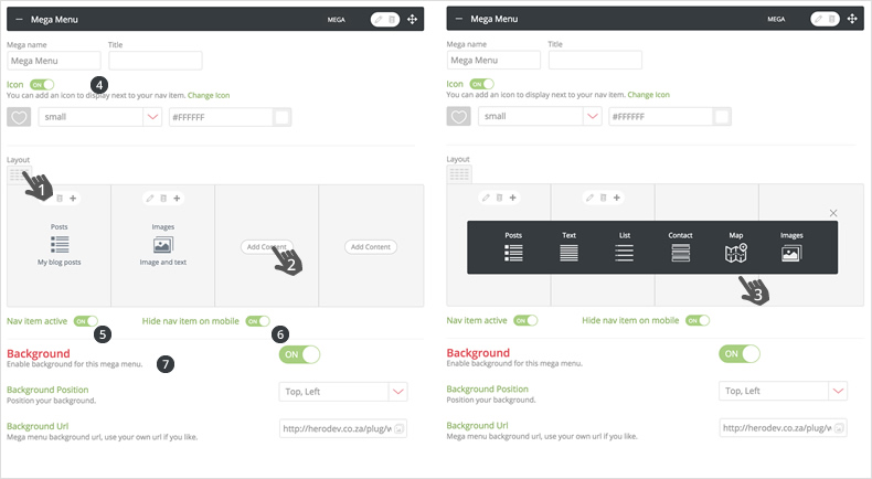
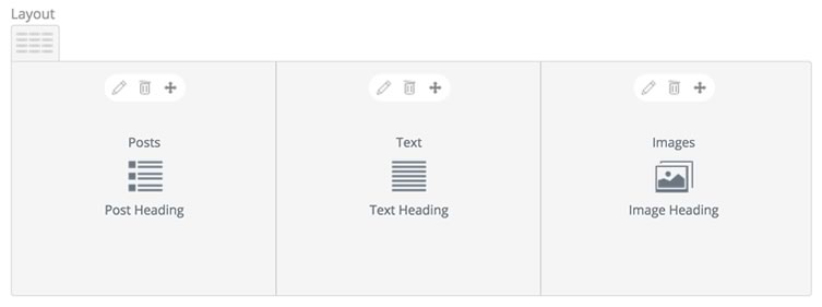
Under the “Layout and Order” tab. Once you have added a mega menu item in your navigation, start editing it by choosing a layout and adding content. Choose the type of content in the dark grey popup and you will then be presented with a settings popup.
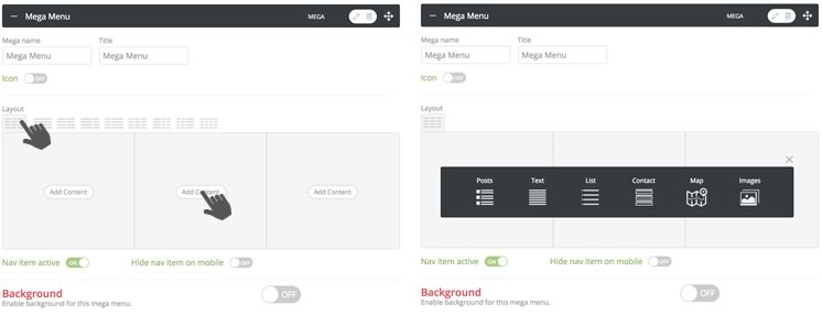
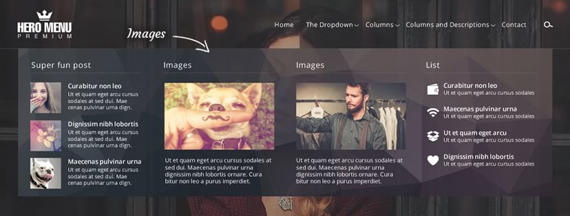
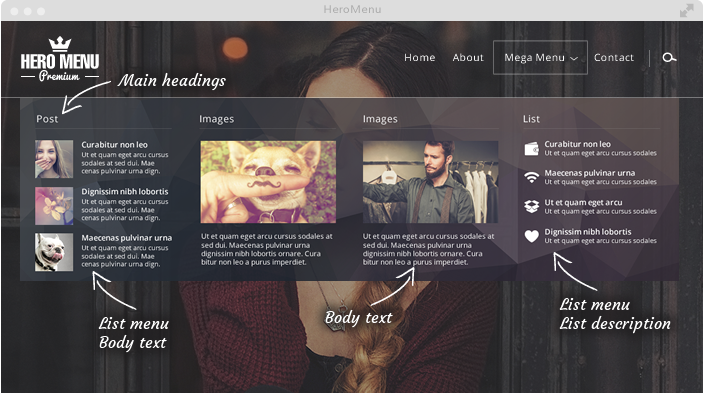
You can give your column a heading, if needed. And choose underline, depending on your design preference. You will see in the example below, we have switched on the “Heading Underline” function and gave the column a name.
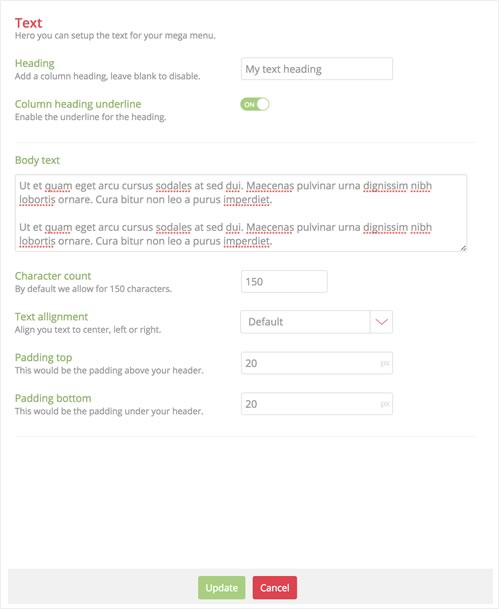
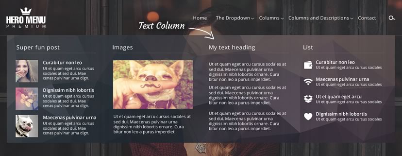
Below is an example of what your text column in your mega menu can look like, just by playing with a few of the settings above.
Under the “Layout and Order” tab. Once you have added a mega menu item in your navigation, start editing it by choosing a layout and adding content. Choose the type of content in the dark grey popup and you will then be presented with a settings popup.

You can give your column a heading, if needed. And choose underline, depending on your design preference. You will see in the example below, we have switched on the “Heading Underline” function and gave the column a name.
Click on the type of list item on the left and then select the items from the list on the right and click “Add List Item”
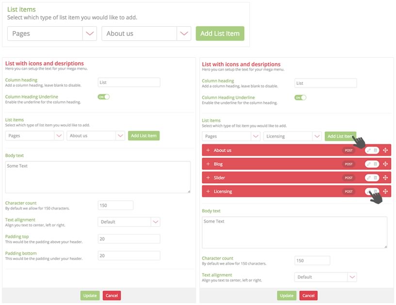
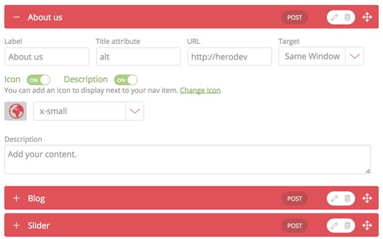
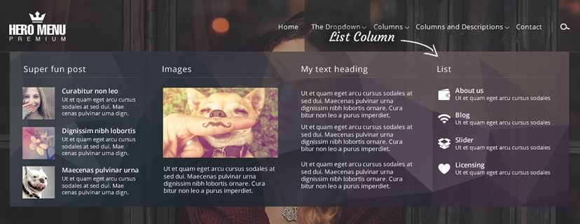
Below is an example of what your list column in your mega menu can look like, just by playing with a few of the settings above. You will see that we have added icons and description text with each list item.
Under the “Layout and Order” tab. Once you have added a mega menu item in your navigation, start editing it by choosing a layout and adding content. Choose the type of content in the dark grey popup and you will then be presented with a settings popup.
You can give your column a heading, if needed. And choose underline, depending on your design preference. You will see in the example below, we have switched on the “Heading Underline” function and gave the column a name.
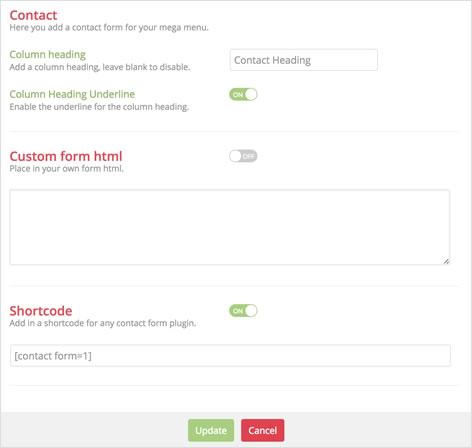
Adding a form to a column can be done in 2 ways.
Sortcode – Create a form using any form plugin and adding the shortcode. (E.g. Gravity Forms, Contact Form 7)
Custom form HTML – This section can used to add in custom form HTML.
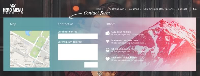
Under the “Layout and Order” tab. Once you have added a mega menu item in your navigation, start editing it by choosing a layout and adding content. Choose the type of content in the dark grey popup and you will then be presented with a settings popup.
You can give your column a heading, if needed. And choose underline, depending on your design preference. You will see in the example below, we have switched on the “Heading Underline” function and gave the column a name.
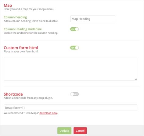
Adding a map to a column can be done in 2 ways.
Sortcode – Create a map using the HeroMaps plugin and adding the shortcode.
Custom map HTML – This section can be used to add in custom map HTML.
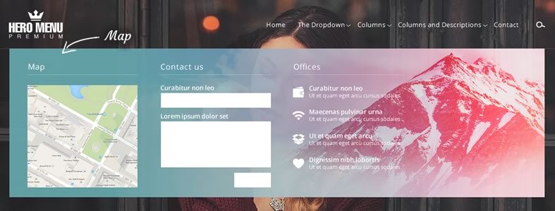
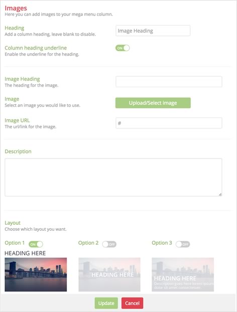
Under the “Layout and Order” tab. Once you have added a mega menu item in your navigation, start editing it by choosing a layout and adding content. Choose the type of content in the dark grey popup and you will then be presented with a settings popup.
You can give your column a heading, if needed. And choose underline, depending on your design preference. You will see in the example below, we have switched on the “Heading Underline” function and gave the column a name.
You also have the option of 3 different layouts of where your text should display.
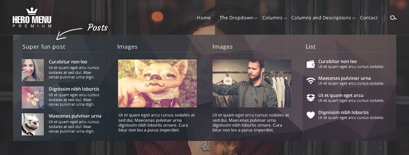
Under the “Layout and Order” tab. Once you have added a mega menu item in your navigation, start editing it by choosing a layout and adding content. Choose the type of content in the dark grey popup and you will then be presented with a settings popup.
You can give your column a heading, if needed. And choose underline, depending on your design preference. You will see in the example below, we have switched on the “Heading Underline” function and gave the column a name.
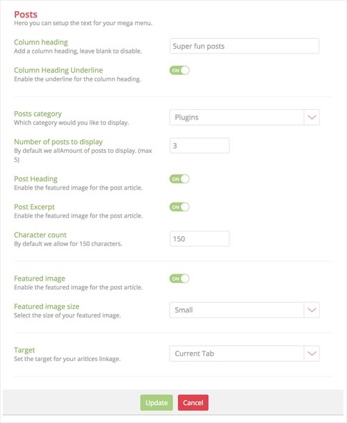
Below is an example of what your posts in your mega menu can look like, just by playing with a few of the settings above.
A very intuitive and visual way to style your navigation. This allows you to style every aspect of your navigation, but by leaving most of the items on this page as default, will be good enough.
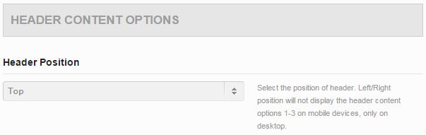
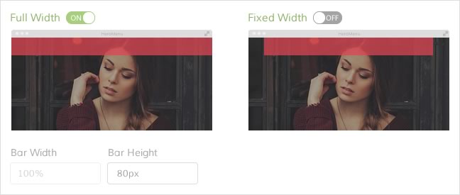
Setting up your menu bar dimensions is an easy 2 step process by clicking the bar width and then choosing the content width.
Choose between a navigation bar that runs the full width of the screen or at a fixed width. (Bound by the parent div container that wraps the HeroMenu navigation)
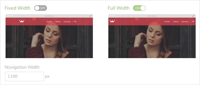
Choose between navigation items that runs the full width of the navigation bar, or a fixed width in the centre of the navigation bar.
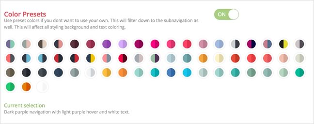
Using our preset colors enable you to select a color example, this will then filter through the whole menu, from the main menu, down to the sub navigation and mega menu.
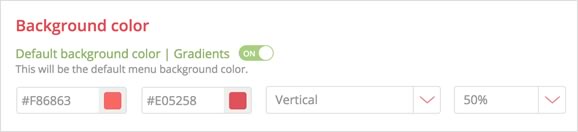
Use your own custom colour by adding in a hex value, or use our color picker. You can also add css gradients in your navigation, by clicking on the “Gradients” button and then selecting or adding your second colour. Gradient orientation can also be changed from vertical to horizontal.
Also change the menu bar transparency as needed.
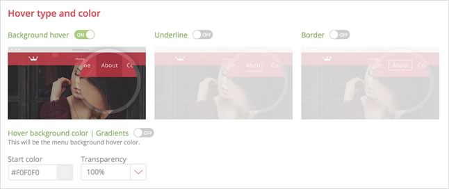
Choose from 3 different types of hover effects. Background hover, Underline and Border. Each one of these hover effects can be styled with your own color.
Switch on the the border button and you can add a thin, 1 pixel border around your navigation bar. You also have the option to only add the border to one of the sides. The colour and transparency can also be changed.
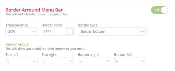
Add rounded corners to your menu bar by changing the border radius.
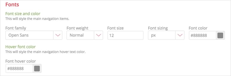
Choose between more than 650 Google fonts from the dropdown. Edit size, weight , color and hover color.
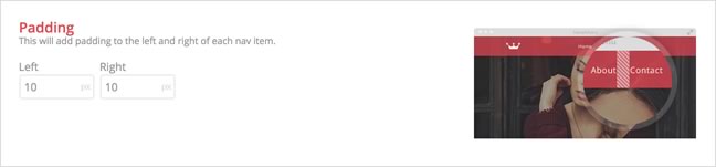
If you feel you need to change the distance between your nav items, feel free to change the padding here. The default setting should be fine.
This will add a shadow to your menu bar. Please note that this function is not supported in older browsers.
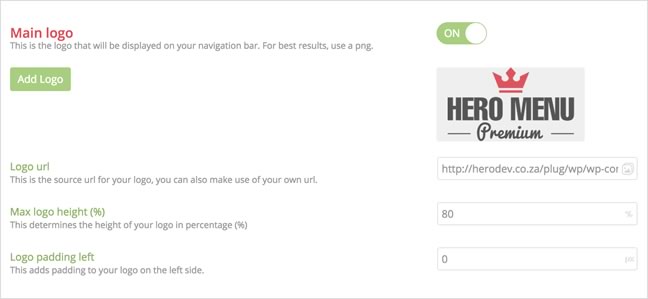
Add a logo to your navigation and add a link if you want the logo clickable. The logo size can be changed by giving it a percentage of the menu bar height. Use a transparent PNG, preferably 600px by 600px.
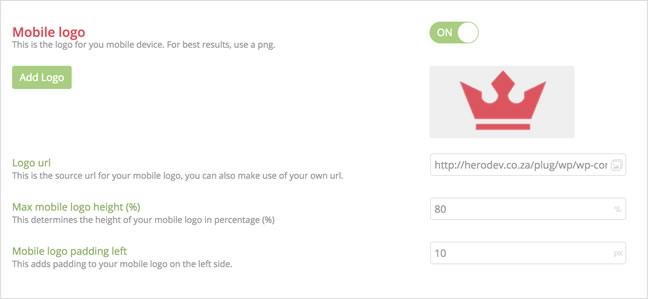
We give you the option to have a replacement company logo when the navigation collapses into a mobile nav.
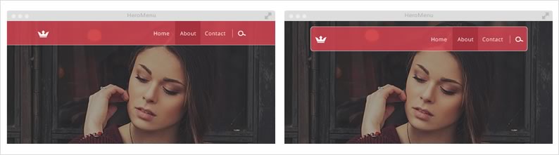
Sticky navigation (also called a fixed navigation) is basically a website menu that is locked into place at the top of the screen so that it does not disappear when the user scrolls down the page; in other words, it is accessible from anywhere on the website without having to scroll.

Activating this will give you a few extra options, like when you want the menu to activate, size, transparency, menu bar color, text color, text size and a different logo if needed.
Here is an example of a menu that becomes a sticky menu when you scroll down.
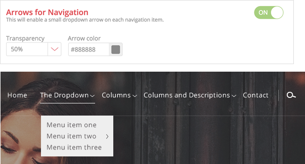
This will enable a small dropdown arrow next to all dropdown navigational items.
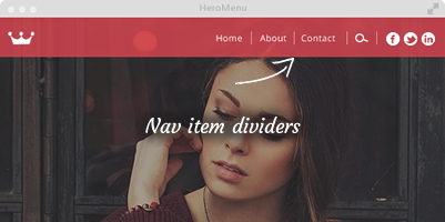
This will enable a line divider between navigational items.
Set the transparency, color and size.
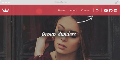
This will add a group divider item between your navigational sections.
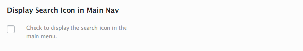
E.g. WooCart, Search, Social
Set the transparency, color and size.
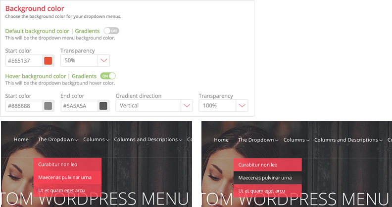
Here you would style what your dropdown menus will look like.
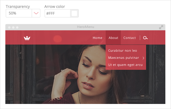
Choosing a color preset on the previous window (Styling – Main Navigation) will also filter through to the drop downs and mega menu. This can easily be changed with the tools supplied here. Add gradients to your drop downs by switching on the gradients setting and choose the start and finish color. Transparency of your dropdown and hover state can also be changed here.
Choose from over 650 Google fonts and set the size, weight and color. Font hover can also be changed here.
Fix the width of all drop downs menus.
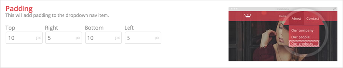
You can set the padding around all submenu items by editing these fields. The default 5px should be sufficient.
Add a css shadow around your dropdown. Set the shadow distance, shadow blur, transparency and color. Please note that this feature does not work in older browsers.
Add a line around your dropdown menu. Add the color you need and set the transparency to fit your design.
Switching this on, will show a small arrow at all fly out menus(sub sub menu). Set the color and transparency as needed.
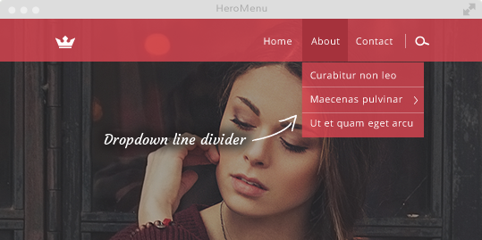
Switching this on, will add a thin line between dropdown menu items. Set the color and transparency you need.
This is the fun part of HeroMenu, where we give you the option to build a great looking mega menu without any coding knowledge.
Choosing a color preset in the “Styling – Main Navigation” section will also filter through to the drop downs and mega menu. This can easily be changed with the tools supplied here. Add gradients to your MegaMenu by switching on the gradients setting and choose the start and finish color.
Background images can also be added to your MegaMenu. (This can be added under “Layout / Navigation Structure”. Each Mega Menu can have its own background image.)
Transparency of your dropdown and hover state can also be changed here.
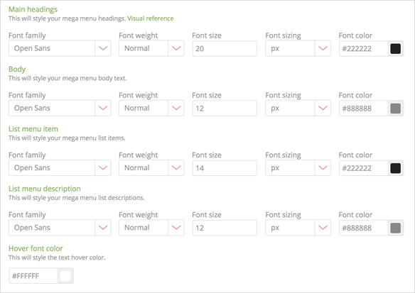
All mega menu font styling in one place. You have all the normal options like Google Fonts, weight, size and color. Hover font color is one setting for all.
The width of MegaMenu is determined by the width of your menu bar dimensions. This can be found in “Styling / Main Navigation / Navigation Width”.

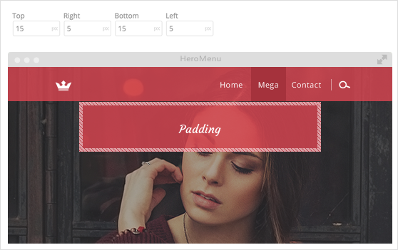
Here you can add padding around your Mega Menu. The default values should be sufficient.
This will add a shadow around your Mega Menu drop down. Please note that this feature is not supported by older browsers. Set the shadow distance, blur, transparency and color.
This will add a one pixel border around your Mega Menu dropdown. You can also set the transparency and color.
Change your square corners to round corners by editing this part.
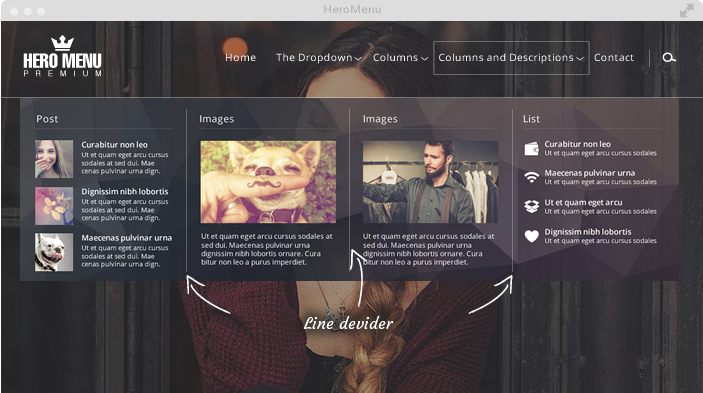
This will add a one pixel vertical divider between all columns in Mega Menu. Transparency and color of these lines can be changed.
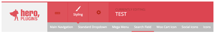
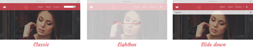
We have 3 different search fields that you can choose from, by simply clicking on the one you prefer.
Here you can set the size of the search box
Set the background color of the input field, if you use the light box search field, this will automatically set the background color of the lightbox.
Set the font to display in the search field. Style, color, size etc can be changed. Search Icon size can also be changed here.
This will add padding to the search field
This will add a border to your search field. If you select lightbox, this will style the color of the line under the text field.
This will allow you to add rounded corners to the classic search field.
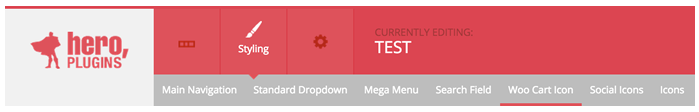
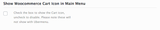
You can activate this icon only if WooCommerce is installed on your website
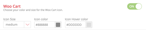
Set the icon size, color and hover color.
The basket icon will have a little circle with the amount of products that was added on your live site.

Here you can activate the social icons you want to add on your nav bar. Just double click the icons you want and this will then be added in sequence beneath the list of icons.
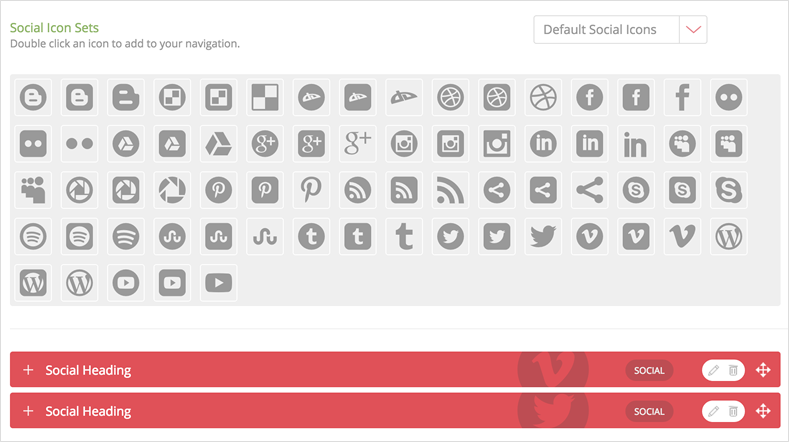
You can drag the red bars in a different order if needed.
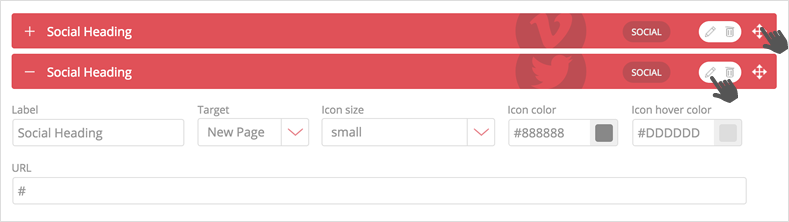
Click on the pencil button to edit the item.
A panel will open where you can now change icon color and hover color and set things like URL etc.
This area is purely for viewing the icons that is available in the plugin.
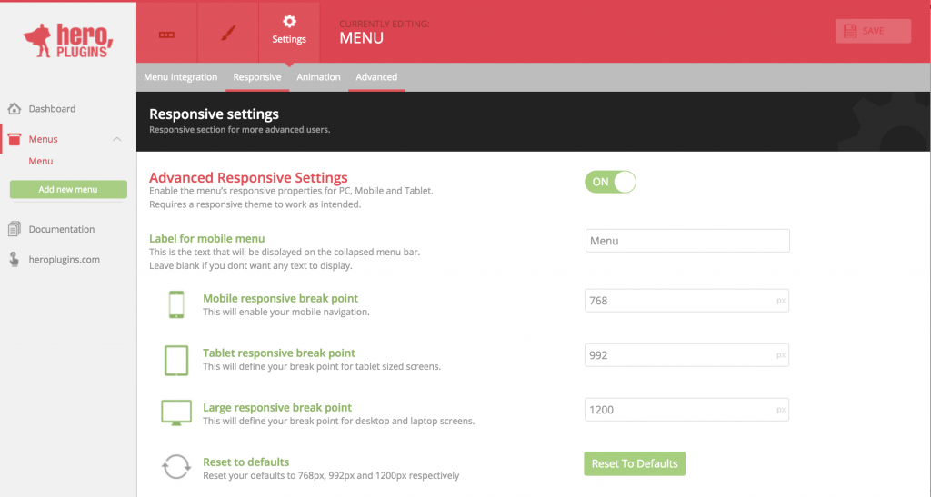
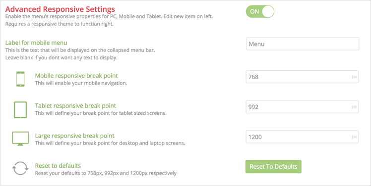
Select the breaking point at which your navigation collapses into a mobile navigation. The defaults should be fine and no need to change.
You can integrate your menu using one of the following steps:
The recommended way of setting your menu, is by selecting the menu location, navigate to Settings » Menu Integration» Select a Location

Theme locations
Theme location labels could change relative to current theme, most themes should have Primary, Main and Secondary.
Add the following shortcode to one of you pages/posts, remember to click update.
[hmenu id=1]
For example, replace the following code in your header.php file:
<header id="masthead" class="site-header" role="banner">
   <a class="home-link" href="<?php echo esc_url( home_url( '/' ) ); ?>" title="<?php echo esc_attr( get_bloginfo( 'name', 'display' ) ); ?>" rel="home">
      <h1 class="site-title"><?php bloginfo( 'name' ); ?></h1>
      <h2 class="site-description"><?php bloginfo( 'description' ); ?></h2>
   </a>
   <div id="navbar" class="navbar">
      <nav id="site-navigation" class="navigation main-navigation" role="navigation">
         <button class="menu-toggle"><?php _e( 'Menu', 'twentythirteen' ); ?></button>
         <a class="screen-reader-text skip-link" href="#content" title="<?php esc_attr_e( 'Skip to content', 'twentythirteen' ); ?>"><?php _e( 'Skip to content', 'twentythirteen' ); ?></a>
         <?php wp_nav_menu( array( 'theme_location' => 'primary', 'menu_class' => 'nav-menu' ) ); ?>
         <?php get_search_form(); ?>
      </nav>
      <!-- #site-navigation -->
   </div>
   <!-- #navbar -->
</header>
<!-- #masthead -->
With the following –
<?php echo do_shortcode( '[hmenu id=1]' ) ?>
Take note
Remember that menu ID in shortcode is subject to change. Please make sure that you are referencing the correct menu ID.
We have seen instances where – during restoration – database entries for HeroMenu were prevented from being properly restored when using BackupBuddy. In order to resolve the issue, please follow the steps below when setting up BackupBuddy:
Stay informed about all new releases and product updates